It has long been realized that scholarly activity does not fall into the traditional, somewhat artificial classification system of scientific fields. Science has a complex and dynamic structure of interconnected and interdependent areas that evolves with time. Scientometrics (the science of science, broadly speaking) provides a macroscopic perspective on the structure of science that is based on the analysis of connectivity patterns in scholarly literature.
Various bibliometric considerations have been used to construct what is commonly referred to as the “map of science” (this is a separate and extensive subject on its own; for a quick overview, have a look at a recent Cobo et al., (2011) review and map gallery). New research fields keep appearing on the map of science, many of which are considered to be highly interdisciplinary. Network graph visualizations provide useful insights into the particularly interesting question of how interdisciplinarity can be assessed for a given emerging field (a review of quantitative approaches is given in (Wagner et al., 2011)).
Our map of science visualization uses Institute of Scientific Information (ISI) subject categories as network nodes, which is one of the most commonly used ontology for peer-reviewed research literature. The edges are based on the analysis of aggregated journal-journal citations by Leydesdorff and Rafols (2009). Node colors distinguish four clusters (network communities) detected using a weighted modularity-based clustering algorithm (Waltman et al., 2010), which broadly correspond to biomedical, physical, environmental, and social sciences.
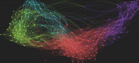
We have used a force-directed algorithm for the network layout, as implemented in Gephi, along with sigma.js JavaScript interactive visualization framework to render the graph on the web. Network data is available for download in both gephi and json formats.
Move the cursor over the visualization area at the bottom of this page to initialize the graph. It is helpful to maximize the browser window for better view; you can drag the network and use scrolling to zoom in/out. Please feel free to tell us your feedback or suggest other visualizations of interest.
Science map visualization: Mouseover to start, scroll to zoom
References
Cobo M, López-Herrera A, Herrera-Viedma E, Herrera F. 2011. Science mapping software tools: Review, analysis, and cooperative study among tools. Journal of the American Society for Information Science and Technology 62:1382–1402. http://doi.wiley.com/10.1002/asi.21525.
Leydesdorff L, Rafols I. 2009. A global map of science based on the ISI subject categories. Journal of the American Society for Information Science and Technology 60:348–362. http://doi.wiley.com/10.1002/asi.20967.
Wagner CS, Roessner JD, Bobb K, Klein JT, Boyack KW, Keyton J, Rafols I, Börner K. 2011. Approaches to understanding and measuring interdisciplinary scientific research (IDR): A review of the literature. Journal of Informetrics 5:14–26. http://linkinghub.elsevier.com/retrieve/pii/S1751157710000581.
Waltman L, Eck NJ van, Noyons EC. 2010. A unified approach to mapping and clustering of bibliometric networks. Journal of Informetrics 4:629–635. http://linkinghub.elsevier.com/retrieve/pii/S1751157710000660.